This image jumped out at me purely for its boldness. The way the model and background match is a clever technique I've seen a lot of fashion photographers do but I think this is one of the most interesting I've seen. The model isn't anything like what you would expect Leibovitz to shoot which is probably why she has camouflaged him in this aztec jungle which is really just a living room. I think this photograph is extremely quirky and slightly humorous and I just think its great.
Wednesday, 24 October 2012
Annie Leibovitz
One of my favorite photographers, I love the way she manages to create a whole entire scene to draw in the viewer and spoil them with content to look at.
Paolo Roversi
I like the simplicity of this image and the statement it makes through the use of monochrome. The photo looks extremely aged, I almost imagine it as a portrait of an acrobat from the circus in the 1800's but because I know the model I know that its not, the photographer is just extremely smart. This image may have been taken on film its hard to tell but the wash over it is really nice giving it the vintage effect suggesting its age. Despite the faded tendency of the image there is also a good amount of contrast stopping the image getting lost in the mist which I also really like.
Tuesday, 23 October 2012
Graphics Talk and Workshop with Jesse Boyce
Jesse Boyce from a small graphic's company called 'Lethal' came to visit us at college and I can say I was really impressed with his work. He has achieved a lot since being in my position of doing a foundation degree at college. Himself and his partner enjoy working especially for the music industry and their biggest success is the British Embassy festival in America, I have heard of this prior to the talk and was very impressed to find out he had been commissioned to do a lot of the art work for the festival including the logo.
In the workshop we had to recreate the Union Jack using lots of different papers and materials, Jesse was really good at helping us out and I really enjoyed the workshop.
Ilustration: Day 2
On the second day of illustration we would be trying to improve our observational skills even more, we chose a stuffed bird in a box and had to draw it with a felt tip pen attatched to a stick.
Then looking at the bird again we had to work back in to the image with ink.
We then did this again but using a paint brush and ink. I used a sponge to put a wash at the bottom of the paper to give a shadow.
We then added more ink to the image to make it appear more 3D and realistic.
Wednesday, 17 October 2012
Illustration: Day 1
In the theory section of illustration we began to look at what illustration actually is and where you see it, as a group we came up with:
Drawing skills are very important in illustration therefore one of our first tasks was used to help us loosen up and improve our drawing skills. First with our our eyes closed we had to feel our faces and draw our features. I found it quite hard but it made me more determined to feel my face better, although I wasn't impressed with the drawing it help my observational skills.
Newspapers
Books/Book Covers
CD covers
Magazines
Posters
Comic's
Advertising
Editorial
Tattoos
Clothing
Products
Greeting Cards
Scientific Illustration
Medical Illustration
Fashion Illustration
Logos
Clip Art
Then we looked at what makes a good illustrator:
Imagination
Passion
Observational Drawing Skills
People Skills
Good contacts
Patience
Dedication
What tools they use:
Pencil
Pen/fine liner
Photoshop
Camera
Watercolour/gouache/acrylic
Sewing machine
Printmaking – Lino, collagraph, etching, monoprinting, screenprinting
Wire
Drawing board/easel
Paper
Collage
Sculpture
Pen/fine liner
Photoshop
Camera
Watercolour/gouache/acrylic
Sewing machine
Printmaking – Lino, collagraph, etching, monoprinting, screenprinting
Wire
Drawing board/easel
Paper
Collage
Sculpture
Then we gave some examples of existing illustrators:
Mick Marston
Herge
Eric Carle
Jaime Zollers
Norman Rockwell
Quentin Blake
Arthur Rackham
Dan Mumford
Edward Gorey
Jon Klassen
Nick Sharrat
Drawing skills are very important in illustration therefore one of our first tasks was used to help us loosen up and improve our drawing skills. First with our our eyes closed we had to feel our faces and draw our features. I found it quite hard but it made me more determined to feel my face better, although I wasn't impressed with the drawing it help my observational skills.
We then did more observational drawings, some we had to use our left hands to draw others we had to only look at the object when drawing these attempts where all intended to improve our observational skills. We also applied masking tape to some drawings so we could re-do some parts afterwards.
Tuesday, 16 October 2012
Ronald Searle
This particular piece caught my eye because of the strong humour and personification. It is absolutely hilarious as the cat poses as some sexy woman on a sofa, it even has breasts and high heels on. The mix of human and cat like qualities is very imaginative and I can see why Searle is very well known in the illustration industry.
Sunday, 14 October 2012
Graphics Review
The Graphics taster week has been my favorite week so far in the exploration stage of my foundation diploma. Everything's been really hands on and I've always had an achievement to aim for at the end of everyday. My knowledge of graphic design before was a bit fuzzy, I was certain about it being involved in something but not others and now after the taster I fully understand it and its disciplines. I enjoyed the fact I was working to a brief I often feel my ideas flow better off of a definite subject/theme than when I am able to create what ever I want because my mind goes in to overload and I get stressed. I've always been interested in advertising and I really want to get in to the fashion photography industry and I feel that graphics has helped me a lot in what goes in to magazines and advisement's, If I wasn't so set on what I already wanted to specialize in I definetley would be considering doing Graphics.
Graphics: Day 3
We scanned our backgrounds on to the computer to add our type, and edit the images.

This was my my first initial idea for 'consume'. I filled the image of lips from the magazine in white to make them less obvious and then added the text I designed from my thumbnails. When making this though It still felt too obvious for me so I experimented more with the image.
This was the final outcome, I took the lips away completely and changed the colour scheme. The letters now look as if they have been chewed up and consumed without the lips being there to tell you that. I like the colour scheme a lot more as it reminds me of a throat with the pinks which again links back to consuming.
This is my final image for 'Rapid'. I again changed the colour scheme to avoid obviousness and I created the type myself by warping the text in Photoshop and then duplicating and layering it, I liked the final outcome.
Final image for 'Stability'. I had two final backgrounds for this word as I had two different ideas, but I settled with the chain one. Chains are meant to be strong and stable and I also created a DNA shape from them, again to represent stability. I created the type in Photoshop from a basic font then I painted in sections to link each of the letters together so they were all connected this enforced my representation of stability. I wasn't fully sure of where to place the type within the image but placed it eventually, I do think however I should play around with the placement more.
Final image for 'Detached'. I made the background for this very quickly and with less thought than the others therefore I wanted to make sure I got the type on this right to make the image still come out okay. I really liked one of my thumbnails and created type from that, similar to stability I linked them all together except for one letter that I left on its own on the right hand side of the image. When I had finished It looked like this.
I felt the image was very weak though so decided to adapt the background to make it stronger. I found and image of a cinder block wall to add to it, I felt this gave a much better effect.
Wednesday, 10 October 2012
Alan Fletcher

British graphic designer born in Kenya, Africa. He was described by the Daily Telegraph 'the most highly regarded graphic designer of his generation' he sadly died in 2006. An exhibition of his life's work was displayed at the Design Museum in London for 3 months starting from November of the year he died. In his lifetime he achieved a great deal including publishing a book Graphic Design: A Visual Comparison, won the Prince Phillip award for designer of the year and was elected to the Hall of Fame of the New York Art Directors Club. Some of his work is still in use, especially logo's he created such as a logo for Reuters and the Victoria and Albert museum.

Kris Sowersby
Typeface designer from New Zealand. 'Feijoa' was his first font released into the market in 2007 and since then he has become a very established typeface designer with his lettering appearing on logos for the Bank of New Zealand and The Harvard Business Review. Due to him being so young Sowersby his work isn't as well documented across the web but I think eventually everyone in the world of design will know his name.


more of his work is displayed here. http://klim.co.nz/
Wim Crouwel
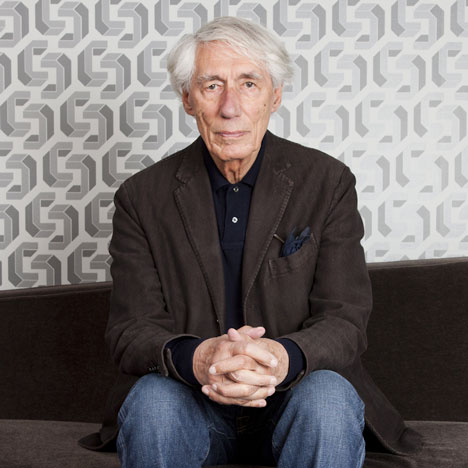
Born in Holland in 1928 Wim Crouwel is a Dutch graphic designer. He set the bench mark with his typography and ever since everyone can not help but be inspired by his work as he along with Alan Fletcher were some of the first of their kind in the world of Graphic Design. He was one of the founders of the design studio Total Design/Total Identity and designed many posters and catalouges. As well as being an designer he also was a teacher and taught at the Royal Academy for Art and Design.
Tuesday, 9 October 2012
Pep Carrio
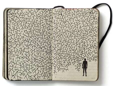
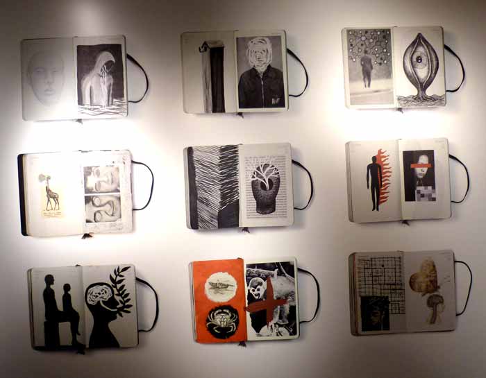
Spanish graphic designer, examples of his sketch books are scattered across the internet as from my research they are very well known. I can see from them the development of his ideas and how I could use the same approach in my own work. 'Portable Laboratory' is what he calls his sketch book hinting he is always at work he must have a similar passion to David Carson, his work doesn't stop just because he's out of the studio.


Noma Bar
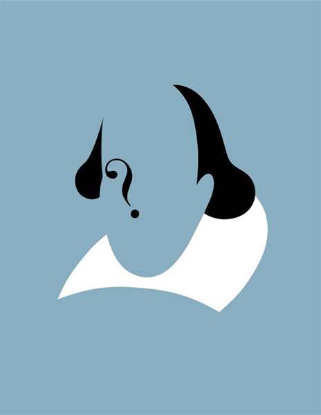
Borin in 1973 in Israel, his work features a lot in the media industry including the BBC and The Observer. He has designed many magazine covers and even has his own books called 'Guess who - The many faces of Noma Bar' and 'Negative Space'. All his work begins in a sketch book then is transferred on to a computer to be finalized. His work is very clever and from what I have seem not all it appears to be until you look closer making it very humourous.


Of all the graphic designers I have researched I find his work the most impressive. The humour in it and the intelligence is all right down my street and I would easily display his work in my home. When first looking at his work the first piece I saw was the third example of the dog, I was a bit critical at first thinking 'its just a dog' until I laughed at myself for missing the cat and mouse in his mouth! I almost felt bad for on first impressions thinking his work was mediocre but I really do love his work and find it very very intriguing.
Stefan Sagmeister


Subscribe to:
Posts (Atom)


.jpg)


